TOP TRUMPS GODDIT
Brand Identity, Packaging & Game Design
GODDIT! started with a brief from the top. The owner of Top Trumps had a clear vision: create a fast-paced, shout-it-out puzzle card game that could compete with the best in the market. The concept was handed to the studio to bring to life, and with a tight deadline from the start, there was no time to overthink it.
Working hands-on alongside one of my senior designers, I took on the logo, packaging, tin and all product visuals, while we collaborated closely on the card artwork across the full 55-puzzle deck.


THE LOGO
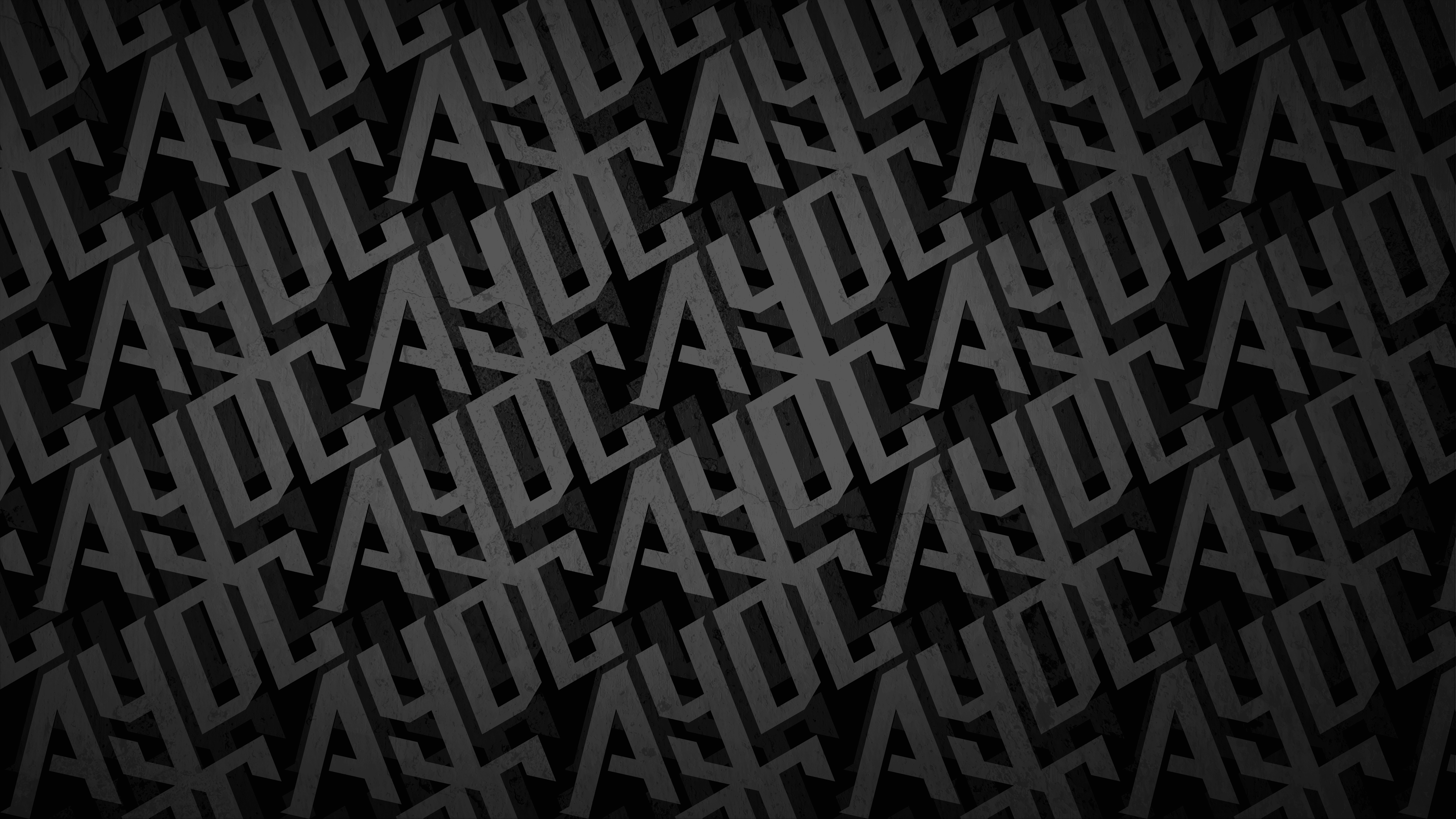
The GODDIT! wordmark was designed at pace, and sometimes that is exactly what a project needs. With limited time to experiment, the creative decisions had to be instinctive. The double D's at the heart of the name presented an opportunity that was too good to ignore: tilt them just right, add a pair of pupils, and suddenly the letters become a set of googly eyes staring back at you. It was a moment of playful experimentation that landed immediately.
The owner loved it, and from that point the eyes became far more than a logo detail. They grew into the visual backbone of the entire identity, and they tie directly into the game's slogan: Play it. Find it. GODDIT! The eyes are always searching, always looking for the answer. Just like the players.
The wordmark is built on
hand-crafted letterforms that
feel warm and human, carrying the spirit of something made with care rather than produced at scale.
For a brand rooted in home cooking and tradition,
that authenticity matters.
The detail work embedded into the type is where the identity really comes alive. Small geometric shapes sit embedded into the words. Drawn from the visual language of traditional African textile design, these details root the brand in its cultural identity and reward a second look.


THE EYE MARKS
Each of the five puzzle types in the game has its own version of the eye mark, acting as a visual cue to the type of challenge on the card. Some are more obvious than others, which adds a layer of discovery to the gameplay itself. It is a simple system that does a lot of work: giving each game type its own personality while keeping the whole deck feeling cohesive.
This was also a deliberate response to a key commercial requirement.
The game needed to work across multiple markets with as little translation and
re-artworking as possible. Keeping the identity language-free and icon-driven meant the same product could travel internationally without losing any of its character.
The wordmark is built on
hand-crafted letterforms that
feel warm and human, carrying the spirit of something made with care rather than produced at scale.
For a brand rooted in home cooking and tradition,
that authenticity matters.
The detail work embedded into the type is where the identity really comes alive. Small geometric shapes sit embedded into the words. Drawn from the visual language of traditional African textile design, these details root the brand in its cultural identity and reward a second look.
Each of the five puzzle types in the game has its own version of the eye mark, acting as a visual cue to the type of challenge on the card. Some are more obvious than others, which adds a layer of discovery to the gameplay itself. It is a simple system that does a lot of work: giving each game type its own personality while keeping the whole deck feeling cohesive.
This was also a deliberate response to a key commercial requirement.
The game needed to work across multiple markets with as little translation and re-artworking as possible. Keeping the identity language-free and icon-driven meant the same product could travel internationally without losing any of its character.


THE PUZZLES
Designing the game was not just a visual exercise. We were presented with puzzle concepts and it was our job to turn them into puzzles that actually worked, each one contained within the confined space of a standard Top Trumps card. Every puzzle type had to be clear, solvable and visually distinct, all within an area not much bigger than a business card. That kind of constraint demands a very different kind of design thinking, and getting it right across 55 cards took as much problem-solving as it did craft.
The wordmark is built on
hand-crafted letterforms that
feel warm and human, carrying the spirit of something made with care rather than produced at scale.
For a brand rooted in home cooking and tradition,
that authenticity matters.
The detail work embedded into the type is where the identity really comes alive. Small geometric shapes sit embedded into the words. Drawn from the visual language of traditional African textile design, these details root the brand in its cultural identity and reward a second look.


THE PACKAGING
The tin is built around a quietly considered detail: its curved form mirrors the rounded edges of a classic Top Trumps card case, a shape that runs as a consistent thread through the wider Top Trumps product family. It is the kind of decision that rewards people who know the brand, while feeling completely natural to those who do not.
Each edition of GODDIT! has its own visual identity to match its theme, with the packaging designed to reflect the world of that particular pack. The format stays consistent, bold and energetic on shelf, while the artwork and palette shift to suit the subject. The "Play it. Find it. GODDIT!" strapline lands the tone in three punchy beats, no matter which edition you are holding.
The wordmark is built on
hand-crafted letterforms that
feel warm and human, carrying the spirit of something made with care rather than produced at scale.
For a brand rooted in home cooking and tradition,
that authenticity matters.
The detail work embedded into the type is where the identity really comes alive. Small geometric shapes sit embedded into the words. Drawn from the visual language of traditional African textile design, these details root the brand in its cultural identity and reward a second look.


THE RESULT
GODDIT! launched as a genuinely original addition to the Top Trumps family.
A fast, portable, language-friendly puzzle game built for families, travellers and anyone who likes a bit of competitive chaos. Designed at speed, built with instinct, and packed with more personality than the timeline had any right to allow.
The DD device proved to have a life well beyond the box too. Bold enough to work at billboard scale, wearable enough to turn a patterned shirt or a graphic tee into something people actually want to own, and playful enough to make a kid the most interesting person in the playground. It is the mark of a strong identity: one that people want to carry with them.
GODDIT! launched as a genuinely original addition to the Top Trumps family. A fast, portable, language-friendly puzzle game built for families, travellers and anyone who likes a bit of competitive chaos. Designed at speed, built with instinct, and packed with more personality than the timeline had any right to allow.
The DD device proved to have a life well beyond the box too. Bold enough to work at billboard scale, wearable enough to turn a patterned shirt or a graphic tee into something people actually want to own, and playful enough to make a kid the most interesting person in the playground. It is the mark of a strong identity: one that people want to carry with them.

LET'S BUILD SOMETHING LEGENDARY
Got a project in mind? We'd love to hear about it. Tell us what you're working on and let's create something worth talking about.
LET'S TALK