Brand Identity, Packaging & Game Design


THE LOGO


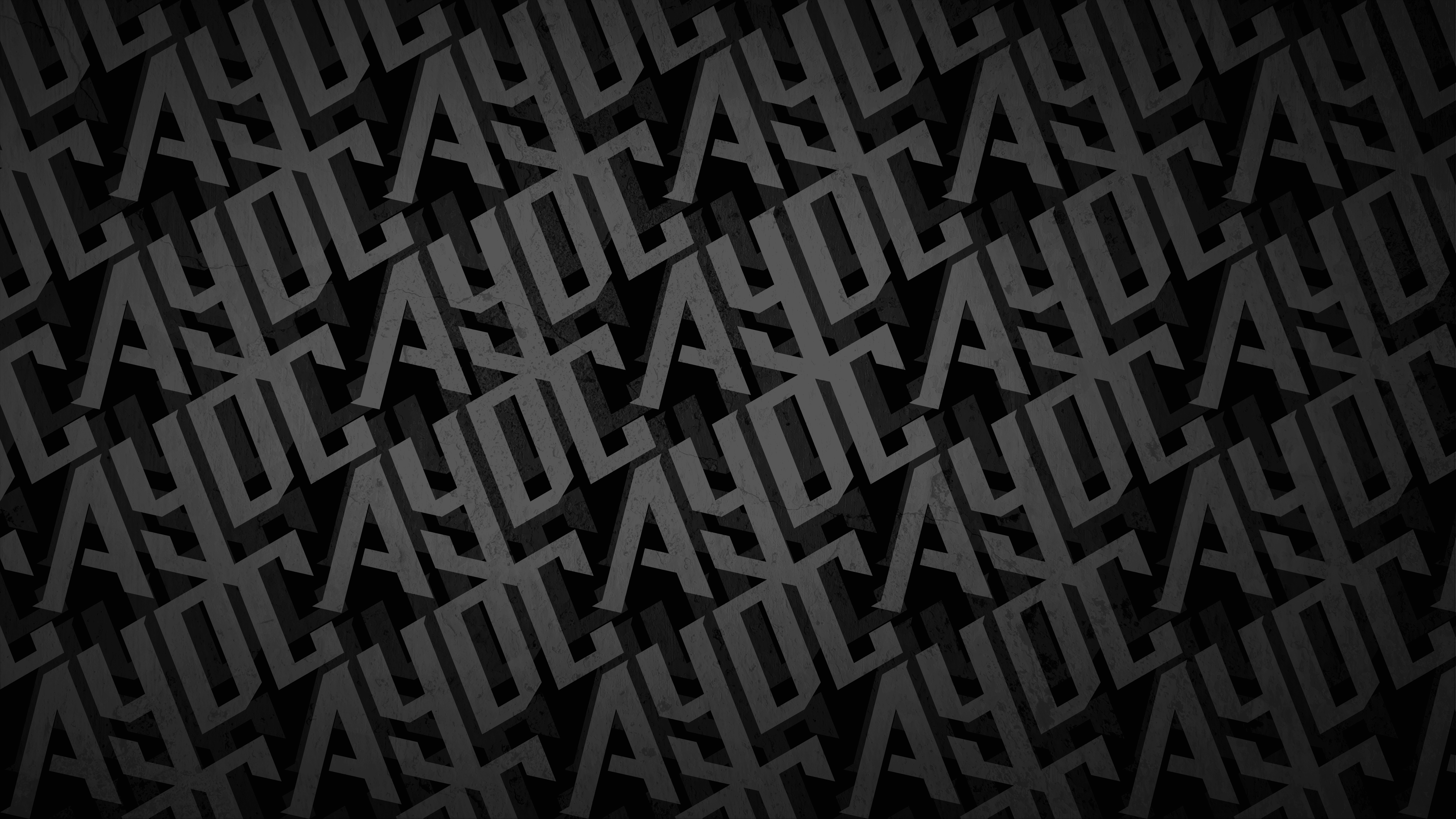
THE PATTERN
The lightning bolt did not stay in the logo. It became the foundation of a repeating pattern used across the wider product range, interlocking bolts tiled diagonally and available across a range of colours and backgrounds, flexible enough to adapt to each edition while keeping the identity instantly recognisable.


THE MAT & TOKENS
Designing the mat was as much an exercise in information design as visual craft. Eleven card spaces, category labels, scoring zones, branding and legal copy all had to work within the confines of a single sheet of folded A4 card. Every element had to earn its place. The football pitch aesthetic on the World Football Stars edition does a lot of heavy lifting, grounding the gameplay in the theme while keeping the layout clear and instinctive to navigate mid-game.
The five strategy tokens follow the same principle. Each carries its own icon and football-themed name, giving players a quick visual reference for each power without needing to re-read the rules every time. Maximum clarity in minimum space, from the mat to the smallest token in the box.


THE PACKAGING


THE RESULT

LET'S BUILD SOMETHING LEGENDARY
Got a project in mind? We'd love to hear about it. Tell us what you're working on and let's create something worth talking about.
LET'S TALK