SAVAGE ELECTRICAL SERVICES
Brand Identity & Visual Rollout
When Lee, the owner of Savage Electrical Services, got in touch, the initial brief was simple: create a logo. The opportunity, however, was much bigger.
As a growing independent electrical contractor, Lee needed a brand that matched the standard of his work. Highly skilled, deeply knowledgeable, and with a reputation built on doing things properly and putting clients first, Lee is the kind of tradesperson customers trust immediately. Friendly, straight-talking, and quick to win people over, the brief was clear: build an identity that reflects exactly who he is. Smart. Reliable. Savage.
When Lee, the owner of Savage Electrical Services,
got in touch, the initial brief was simple: create a logo.
The opportunity, however, was much bigger.
As a growing independent electrical contractor, Lee needed a brand that matched the standard of his work. Highly skilled, deeply knowledgeable, and with a reputation built on doing things properly and putting clients first, Lee is the kind of tradesperson customers trust immediately. Friendly, straight-talking, and quick to win people over, the brief was clear: build an identity that reflects exactly who he is.
Smart. Reliable. Savage.
When Lee, the owner of Savage Electrical Services, got in touch, the initial brief was simple: create a logo. The opportunity, however, was much bigger.
As a growing independent electrical contractor, Lee needed a brand that matched the standard of his work. Highly skilled, deeply knowledgeable, and with a reputation built on doing things properly and putting clients first, Lee is the kind of tradesperson customers trust immediately. Friendly, straight-talking, and quick to win people over, the brief was clear: build an identity that reflects exactly who he is.
Smart. Reliable. Savage.

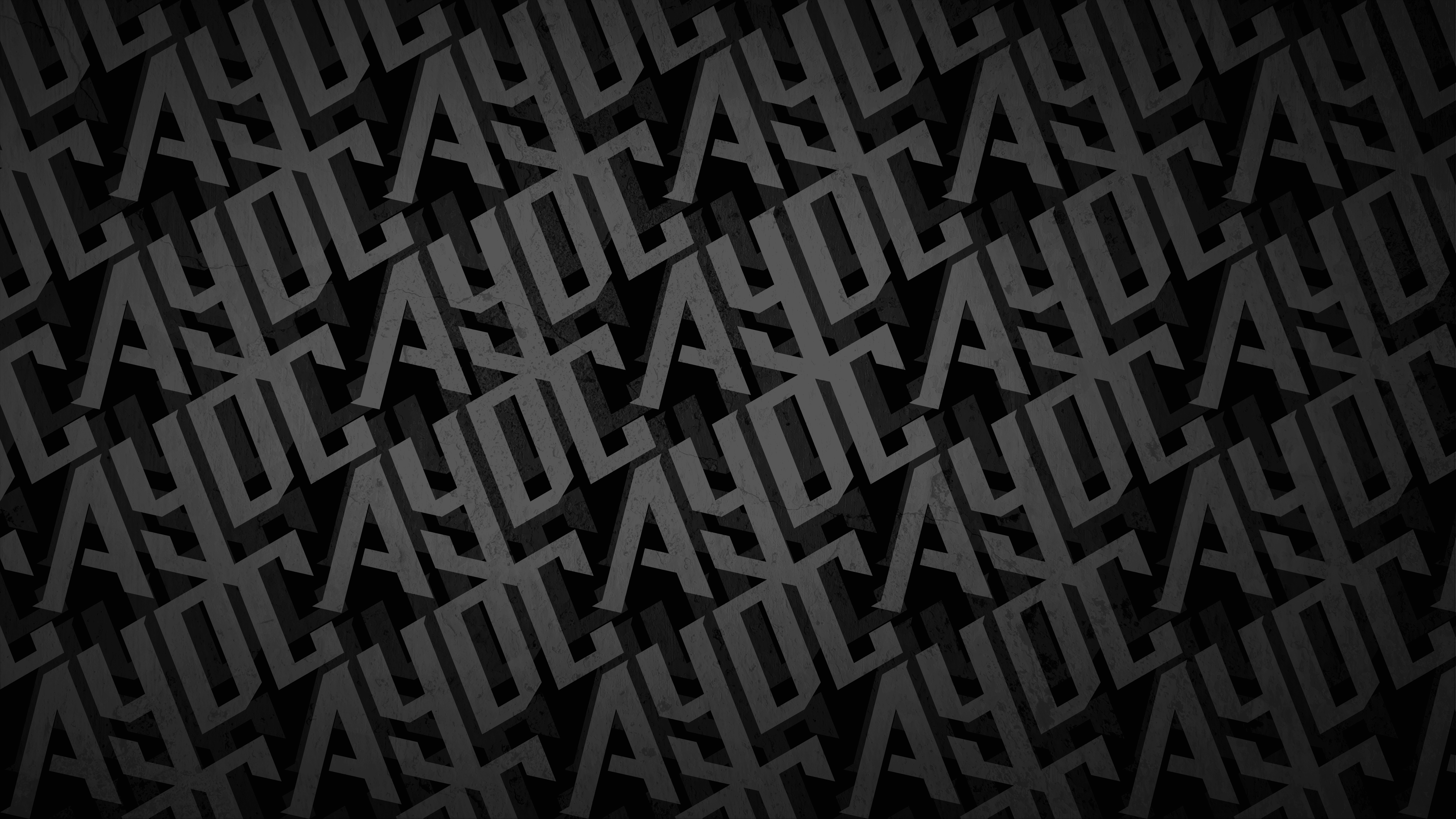
THE WORDMARK
At the heart of the identity is a bold, industrial wordmark built to feel solid, confident, and built to last.
Rather than leaning on predictable lightning bolt icons, the concept embeds the idea of electricity directly into the typography. The wide, geometric letterforms create immediate impact, while sharp internal angles introduce controlled tension and forward momentum, echoing the hands-on, problem-solving nature of the trade.
The key detail lives in the negative space between the V and A in SAVAGE. That angular break forms a subtle lightning bolt, hidden in plain sight. It injects energy into the mark without compromising its professionalism, giving the brand an ownable visual cue that rewards a second look.
At the heart of the identity is a bold, industrial wordmark built to feel solid, confident, and built to last.
Rather than leaning on predictable lightning bolt icons,
the concept embeds the idea of electricity directly into the typography. The wide, geometric letterforms create immediate impact, while sharp internal angles introduce controlled tension and forward momentum, echoing the hands-on, problem-solving nature of the trade.
The key detail lives in the negative space between the V and A in SAVAGE. That angular break forms a subtle lightning bolt, hidden in plain sight. It injects energy into the mark without compromising its professionalism, giving the brand an ownable visual cue that rewards a second look.
At the heart of the identity is a bold, industrial wordmark built to feel solid, confident, and built to last.
Rather than leaning on predictable lightning bolt icons, the concept embeds the idea of electricity directly into the typography.
The wide, geometric letterforms create immediate impact,
while sharp internal angles introduce controlled tension and forward momentum, echoing the hands-on, problem-solving nature of the trade.
The key detail lives in the negative space between the V and A in SAVAGE. That angular break forms a subtle lightning bolt, hidden in plain sight. It injects energy into the mark without compromising its professionalism, giving the brand an ownable visual cue that rewards a second look.


THE BRANDMARK
The brandmark distils the identity into a compact, high-impact emblem.
Constructed from interlocking letterforms, the monogram creates a sense of connection and continuity, a subtle nod to circuitry and electrical flow. The same lightning fracture appears here too, carved from the negative space between the S and E. That visual echo ties the whole system together, making sure the concept is not isolated to one execution but embedded into
the DNA of the brand.
Framed within a solid square, the emblem balances energy with structure.
The outer boundary brings stability and authority, while the internal angular cuts introduce movement and charge. A deliberate tension between control and power.
The brandmark distils the identity into a compact,
high-impact emblem.
Constructed from interlocking letterforms, the monogram creates a sense of connection and continuity, a subtle nod to circuitry and electrical flow. The same lightning fracture appears here too, carved from the negative space between the S and E. That visual echo ties the whole system together, making sure the concept is not isolated to one execution but embedded into the DNA of the brand.
Framed within a solid square, the emblem balances energy with structure. The outer boundary brings stability and authority, while the internal angular cuts introduce movement and charge. A deliberate tension between control and power.
The brandmark distils the identity into a compact, high-impact emblem.
Constructed from interlocking letterforms, the monogram creates a sense of connection and continuity, a subtle nod to circuitry and electrical flow.
The same lightning fracture appears here too, carved from the negative space between the S and E. That visual echo ties the whole system together, making sure the concept is not isolated to one execution but embedded into the DNA of the brand.
Framed within a solid square, the emblem balances energy with structure. The outer boundary brings stability and authority, while the internal angular cuts introduce movement and charge.
A deliberate tension between control and power.


THE RESULT
This identity was not designed to sit quietly. It was built to work hard across everything Lee's business touches: business cards, invoicing, stitched embroidery, vehicle graphics, shopfronts, and high-contrast environments.
The high-visibility yellows paired with deep black draw from the visual language of industrial safety and hazard signage, a palette synonymous with awareness, precision, and technical competence.
Every decision, from the structural framing to the embedded negative-space detail, ensures the brand feels smart in its thinking, reliable in its execution, and savage in its presence.
This identity was not designed to sit quietly. It was built to work hard across everything Lee's business touches: business cards, invoicing, stitched embroidery, vehicle graphics, shopfronts, and high-contrast environments.
The high-visibility yellows paired with deep black draw from the visual language of industrial safety and hazard signage,
a palette synonymous with awareness, precision, and technical competence.
Every decision, from the structural framing to the embedded negative-space detail, ensures the brand feels smart in its thinking, reliable in its execution, and savage in its presence.

LET'S BUILD SOMETHING LEGENDARY
Got a project in mind? We'd love to hear about it. Tell us what you're working on and let's create something worth talking about.
LET'S TALK