MAMA KONGO
Brand Identity, Packaging & Visual Rollout
Mama Kongo is a Congolese kitchen with roots in Camden, London. Built on a passion for home-cooked traditional recipes, the brand brings the warmth, flavour and colour of Congolese cuisine to a UK audience. The brief was to build an identity that honoured their heritage and had the energy to grow with them, including an exciting expansion into the
Congolese tea and coffee market.
The project started with a redraw of their existing logo: a portrait of a Congolese woman in a traditional headwrap. I redrew her with more life and detail, and the rich colour and pattern of that headwrap became the creative spark for everything that followed.
Mama Kongo is a Congolese kitchen with roots in Camden, London. Built on a passion for home-cooked traditional recipes, the brand brings the warmth, flavour and colour of Congolese cuisine to a UK audience. The brief was to build an identity that honoured their heritage and had the energy to grow with them, including an exciting expansion into the Congolese tea and coffee market.
The project started with a redraw of their existing logo:
a portrait of a Congolese woman in a traditional headwrap.
I redrew her with more life and detail, and the rich colour and pattern of that headwrap became the creative spark
for everything that followed.

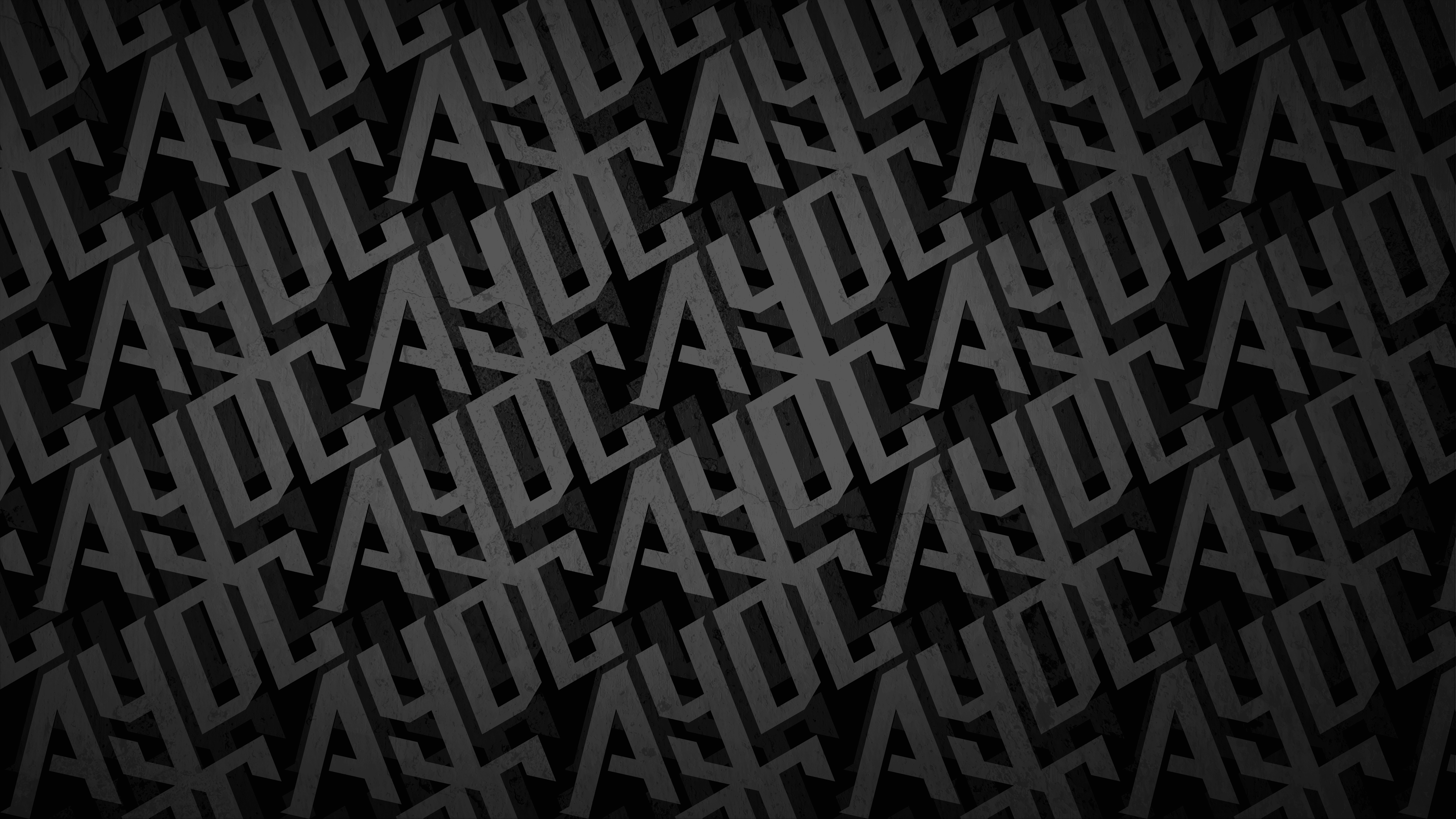
THE WORDMARK
The wordmark is built on hand-crafted letterforms that feel warm and human, carrying the spirit of something made with care rather than produced at scale. For a brand rooted in home cooking and tradition, that authenticity matters.
The detail work embedded into the type is where the identity really comes alive. Small geometric shapes sit embedded
into the words. Drawn from the visual language of traditional African textile design,
these details root the brand in its cultural identity and reward a second look.
The wordmark is built on
hand-crafted letterforms that
feel warm and human, carrying the spirit of something made with care rather than produced at scale.
For a brand rooted in home cooking and tradition,
that authenticity matters.
The detail work embedded into the type is where the identity really comes alive. Small geometric shapes sit embedded into the words. Drawn from the visual language of traditional African textile design, these details root the brand in its cultural identity and reward a second look.
The wordmark is built on hand-crafted letterforms that feel warm and human, carrying the spirit of something made with care rather than produced at scale. For a brand rooted in home cooking and tradition, that authenticity matters.
The detail work embedded into the type is where the identity really comes alive. Small geometric shapes sit embedded
into the words. Drawn from the visual language of traditional African textile design, these details root the brand in its cultural identity and reward a second look.
THE BRANDMARK
The MK monogram distils the identity into a compact, badge-like symbol. The wide, splayed form of the M echoes the shape of an open fire, and with three loose wisps of red-orange steam rising above it, the whole mark feels alive and alight. It is a purposeful reference to cooking, heat and warmth, framed within a square border that gives it the authority of a stamp and the pride of something worth putting your name to.
The MK monogram distils the identity into a compact,
badge-like symbol. The wide, splayed form of the M echoes the shape of an open fire, and with three loose wisps of red-orange steam rising above it, the whole mark feels alive and alight.
It is a purposeful reference to cooking, heat and warmth, framed within a square border that gives it the authority of a stamp and the pride of something worth putting your name to.
The MK monogram distils the identity into a compact,
badge-like symbol. The wide, splayed form of the M echoes the shape of an open fire, and with three loose wisps of
red-orange steam rising above it, the whole mark feels alive and alight. It is a purposeful reference to cooking, heat and warmth, framed within a square border that gives it the authority of a stamp and the pride of something worth putting your name to.


THE PATTERN
The supporting pattern is the heartbeat of the brand. Bold geometric shapes in yellow, purple, blue, green, red and orange draw from the geometric traditions of Kuba cloth, while the explosive colour palette leans into the celebratory vibrancy of Kanga and Kitenge textiles. Vibrant without being chaotic, and cultural without being pastiche, it carries all the warmth and energy of the food it represents.
The supporting pattern is the heartbeat of the brand.
Bold geometric shapes in yellow, purple, blue, green, red
and orange draw from the geometric traditions of Kuba cloth, while the explosive colour palette leans into the celebratory vibrancy of Kanga and Kitenge textiles. Vibrant without being chaotic, and cultural without being pastiche, it carries all the warmth and energy of the food it represents.


THE RESULT
The identity travels brilliantly across every touchpoint. On packaging, the pattern wraps each product as a bold graphic band while the monogram anchors the front cleanly on black. Each application feels part of the same family, each with its own energy, each unmistakably Mama Kongo.
Clothing and merch is where the pattern really gets to breathe. Swept across sleeves, wrapped around uniforms, printed on the things people actually want to wear, it turns anyone representing the brand into a walking embodiment of it.
In a food market or festival environment, the identity scales up and commands the space.
Bold, immersive and impossible to miss, it draws people in before they have even seen the menu.
Mama Kongo now has an identity as rich and layered as the food it serves. Bold, warm, and impossible to ignore.
The identity travels brilliantly across every touchpoint.
On packaging, the pattern wraps each product as a bold graphic band while the monogram anchors the front cleanly on black. Each application feels part of the same family, each with its own energy, each unmistakably Mama Kongo.
Clothing and merch is where the pattern really gets
to breathe. Swept across sleeves, wrapped around
uniforms, printed on the things people actually want
to wear, it turns anyone representing the brand into
a walking embodiment of it.
In a food market or festival environment, the identity
scales up and commands the space. Bold, immersive and impossible to miss, it draws people in before they have
even seen the menu.
Mama Kongo now has an identity as rich and layered as the food it serves. Bold, warm, and impossible to ignore.

LET'S BUILD SOMETHING LEGENDARY
Got a project in mind? We'd love to hear about it. Tell us what you're working on and let's create something worth talking about.
LET'S TALK